
A New Kind of Spirit-uality
Perth, Ontario is an area rich in the production of liquor and punctuated by the trailblazers who’ve brought it to life. Top Shelf Craft Distillers creates vodkas and gins that are pure and balanced, Canadian-made and uncompromised.
Categorizing itself as a rebellious provocateur, Top Shelf is committed to knocking the boots off consumers, and needed a marketing agency to be a willful co-conspirator to its mission. As such, CT was hired to craft a compelling brand identity.
Goals:
Create a distinct and compelling brand identity
Develop a clever, witty, and provocative tone of voice for messaging
Design a suite of eye-catching assets
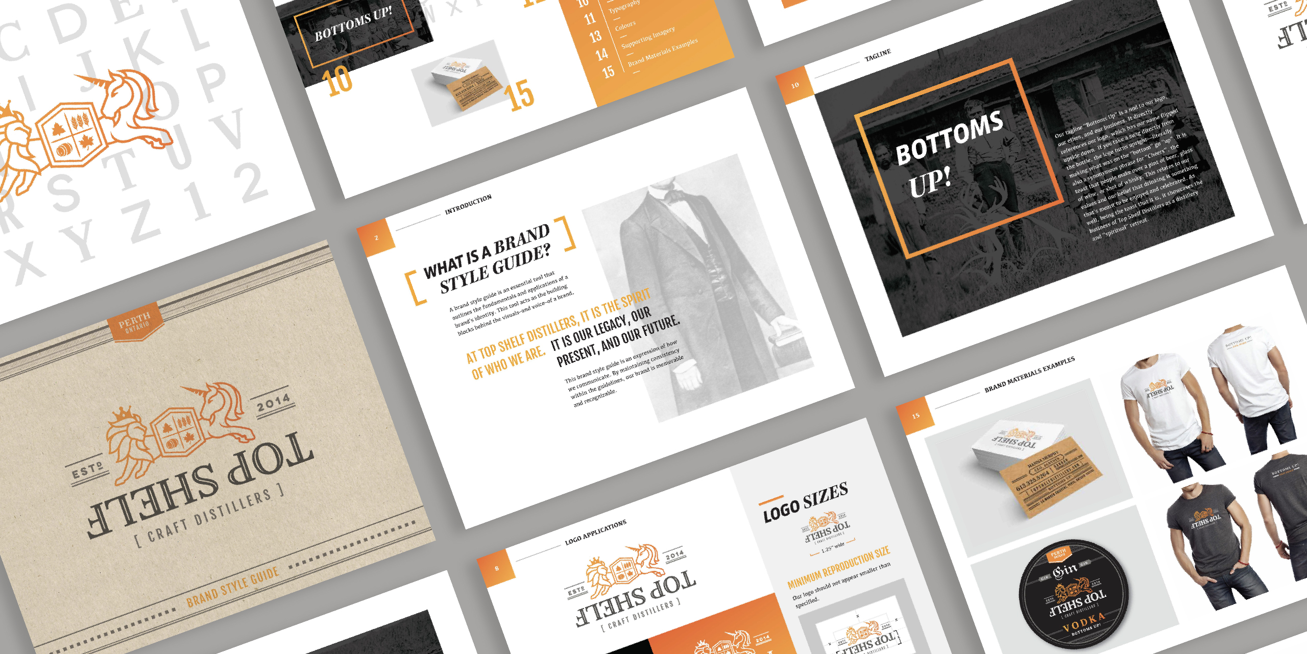

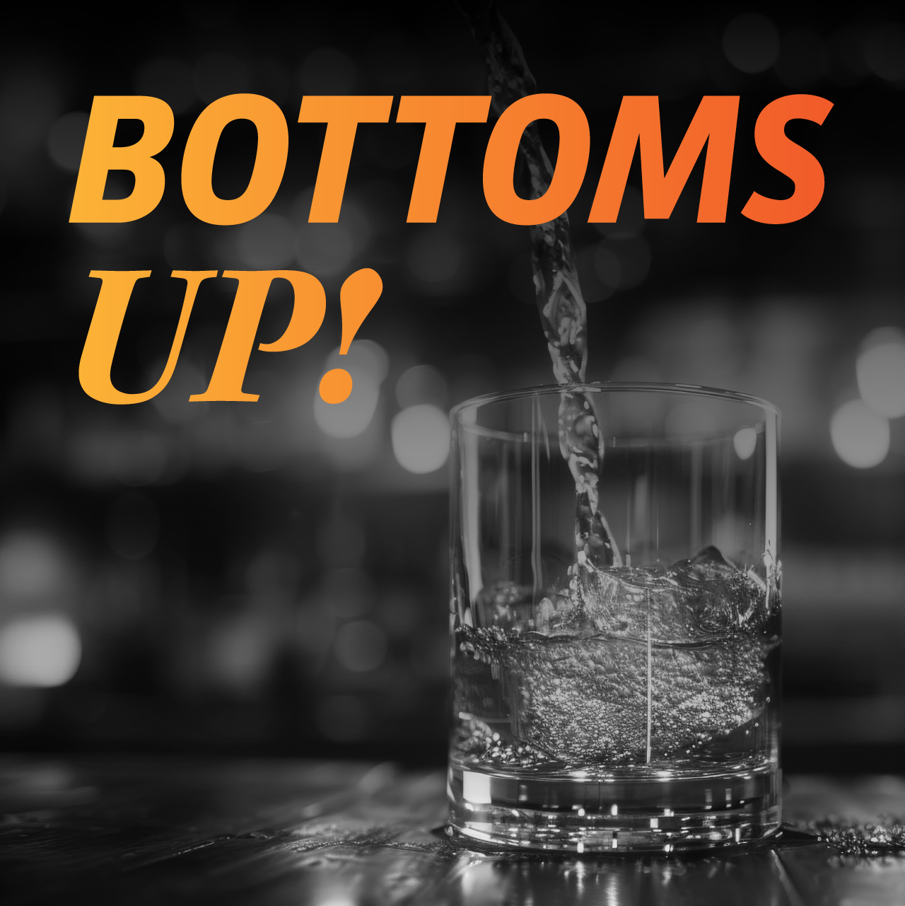
Bottoms Up!
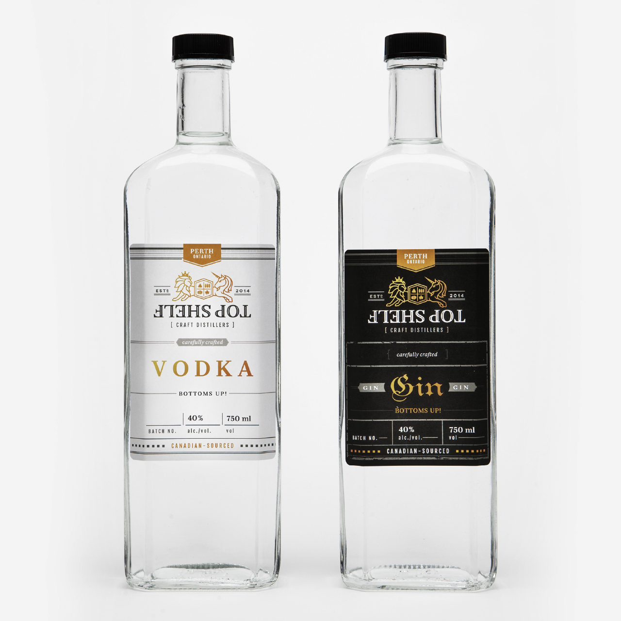
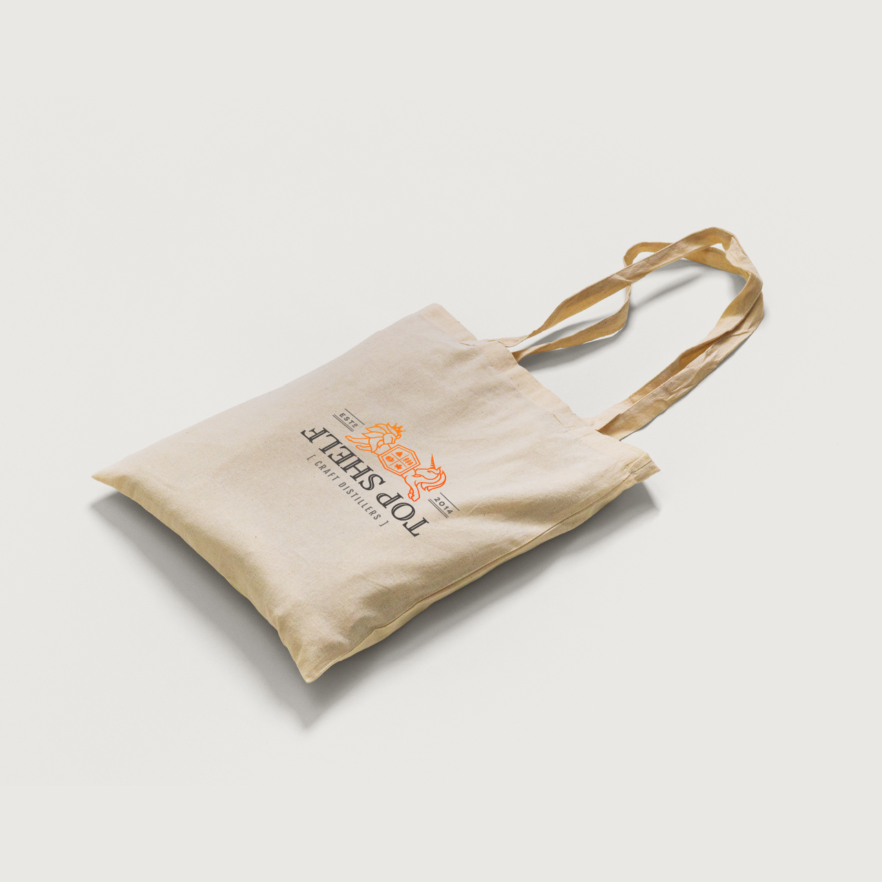
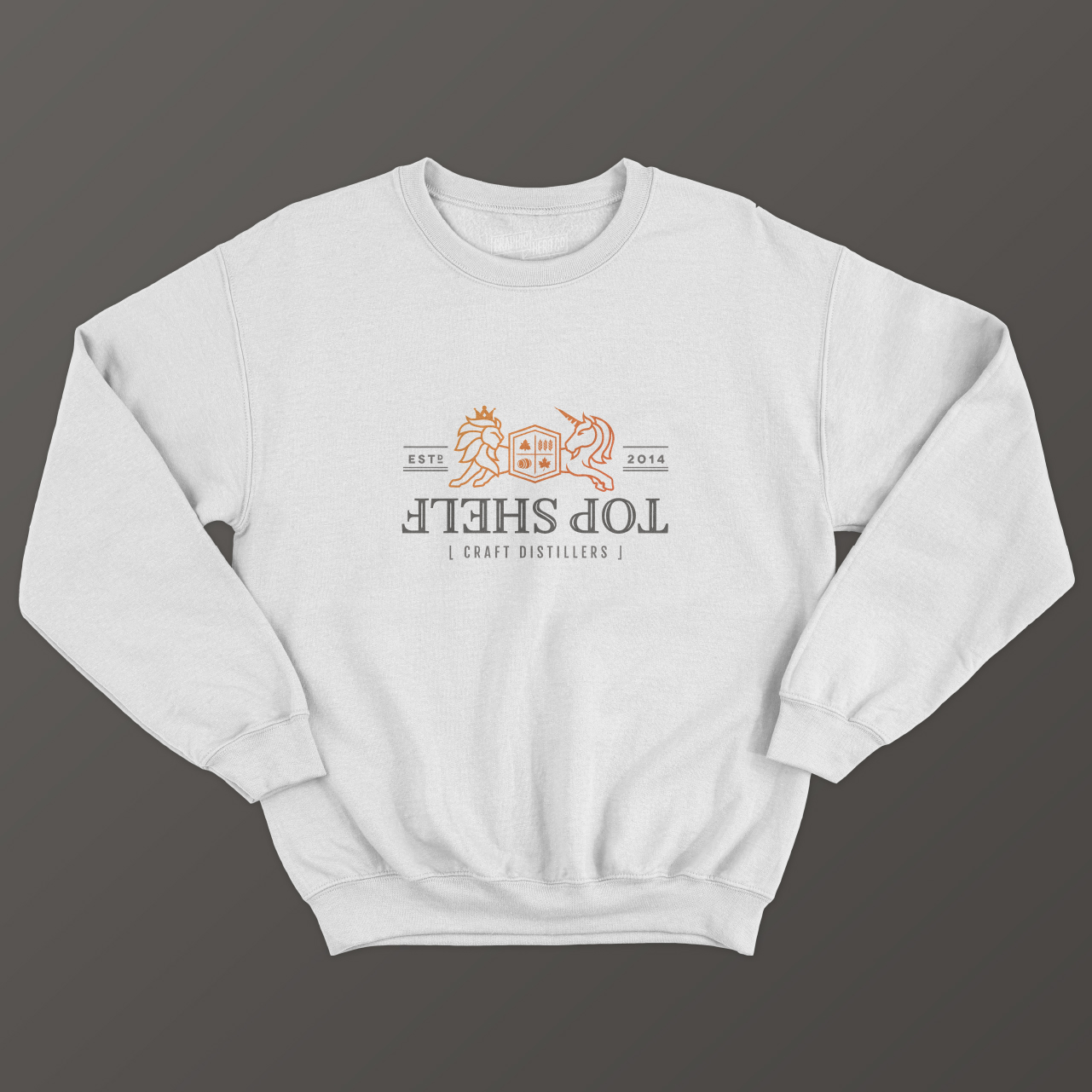
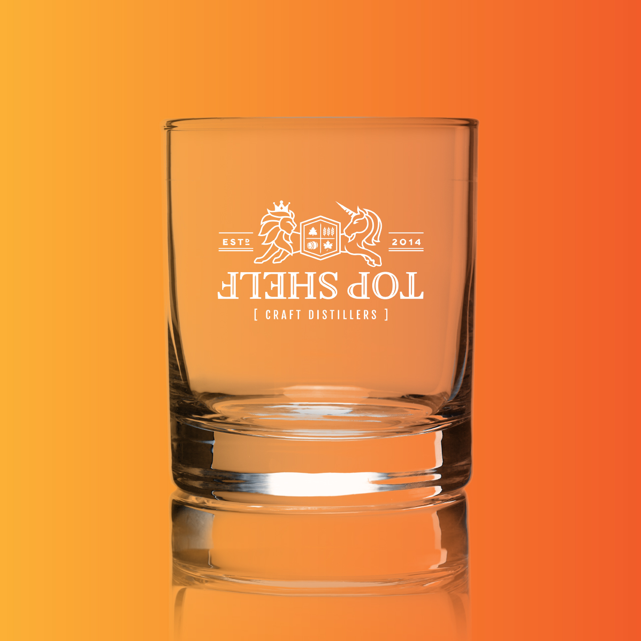
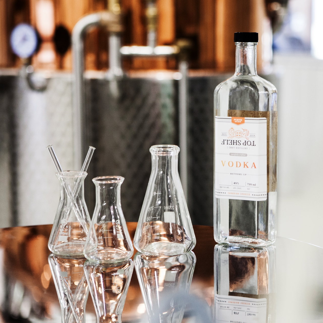
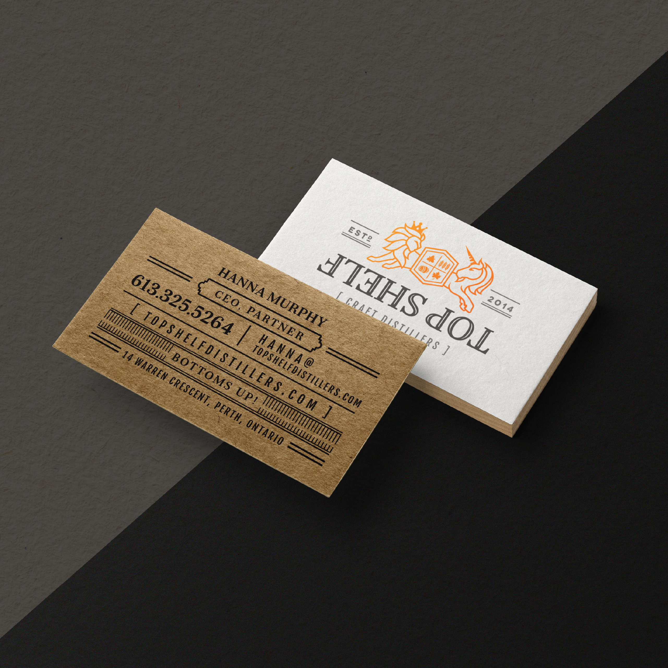
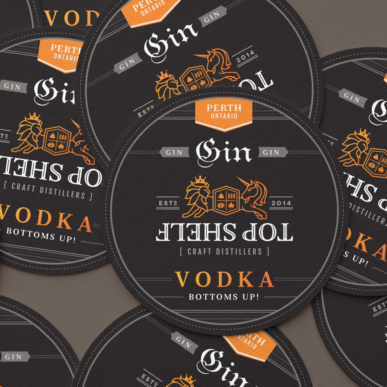
Top Shelf’s logo is a tribute to its history — inspired by the lion and unicorn on the official coat of arms for the British monarchy, but customized to represent the company. The trillium is representative of Ontario, while the maple leaf symbolizes our great country. For distilling, we used the emblems of a barrel and sheaves of grain. We flipped the name upside down to show that we look at things differently, including drinking. Using orange and grey as colour choices enables Top Shelf to stand out from other liquor bottles and to show that it’s unique, attention-grabbing, and uncompromising.
Worth a Cheers
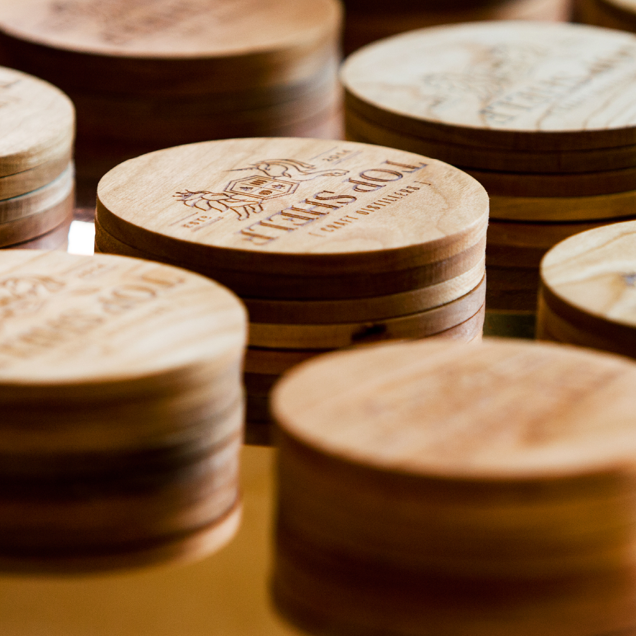
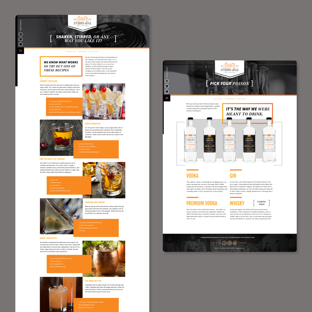
Spanning bottles and coasters to swag and an accessible website design, CT took the business of badassery to heart: creating a surprisingly cheeky and refreshingly vibrant identity to help Top Shelf stand out from the crowd.