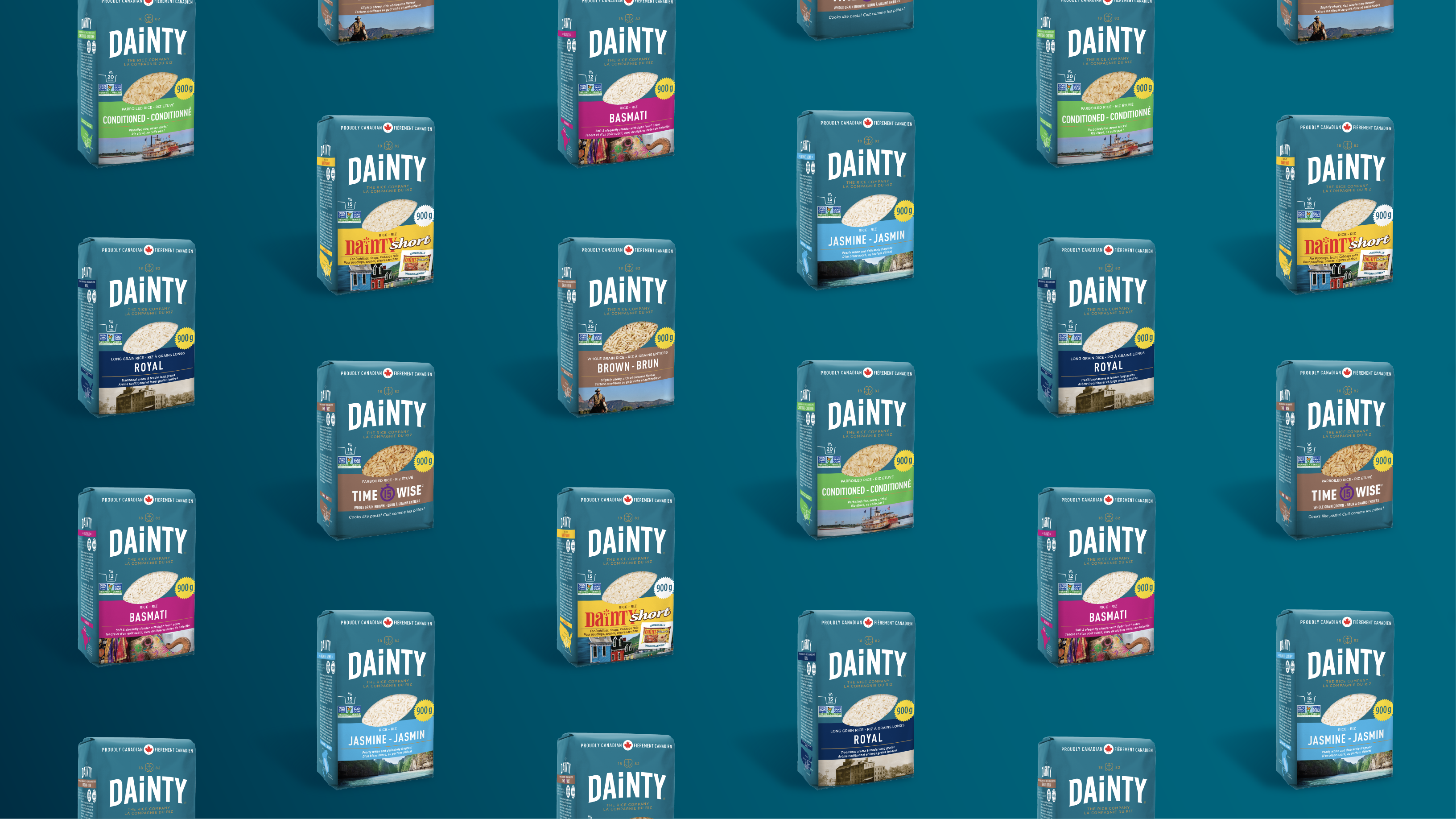
One of the most important yet challenging aspects of digital advertising is designing eye-catching, memorable, and beautiful visuals to accompany your ads.
If you want to stand out from all the noise online, you need to make sure your designs make a bold statement. Great design sends the right message to your target audience, showcases what your brand is all about, and leaves a lasting impression on users.
Below are 3 graphic design tips to enhance your next digital ad campaign.
Tips:
Map out layout and structure
Identify a colour scheme and stick to it
Don’t settle on typography
Map out layout and structure
When planning the layout and structure of your digital ads, white space will be your best friend. White space, or blank space, is the space between text, graphics, images, and other other design elements. This intentional blank space placed within your digital ads allows you to pull focus to key areas within the visual, keep designs clean and minimalistic, and helps you better organize content.
Visuals within digital ads also need to be accompanied by powerful content. The following key items may be utilized to compliment your visuals, so that users know who you are, what you offer, and how to engage with your brand/services:
- Company logo and name: on display ads, you will want to clearly define your brand so that your audience can easily identify you. This is not always necessary, as some ad platforms do this automatically for you, such as Facebook
- Value proposition: be sure to describe the benefits users gain when engaging with your brand/business
- An image, graphic, or animation that represents your brand: get creative by including valuable and engaging imagery within ads, to catch the attention of your audience
- A clear call to action: be sure to define a clear goal for your digital ad, and encourage users to take action on your ad based on this goal
Need inspiration? Check out Dribbble and see how the talented designers below incorporated some of the ideas outlined above
1. Instagram Stories
Artist: Janna Hagan
2. General Ads
Artist: Sohag
NOTE: most ad platforms have either recommended or firm character limits that need to be observed, so keep this in mind while crafting ad visuals and content.
Identify a colour scheme and stick to it
Colours play a huge role within design thinking, and they can dictate the mood of your digital ads. Your colour scheme should align with your company’s brand whenever possible. These colours should be selected based on:
- Target audience of the campaign
- Industry trends/standards
Don’t be afraid to get colourful (and use your brand’s secondary colour palette), but more often than not, less is more. You will also want to ensure your colour scheme is accessible, meaning that the colours used for various fonts and visual elements are legible.
You can use free tools like WebAIM’a contrast checker in order to determine if your colour scheme meets accessibility standards. The good news is, a logo does not have to pass these requirements!
Don’t settle on typography
It can be tempting to settle on system fonts for graphic design needs, but don’t be afraid to venture out of your comfort zone and play around with typography that may better compliment your brand fonts and messaging. Typography has the power of drawing our attention to specific places on a page or screen, so choosing the right fonts will heavily affect your digital ad’s overall impact on your audience. Typography also allows you to add hierarchy with designs, keeping visuals organized and concise.
Our go-to tool for typography is Google Fonts. They have an extensive catalogue of fonts to choose from, and the platform allows you to easily download fonts for web and graphic design purposes.
Once you nail down the principles of design, don’t be afraid to step out of your comfort zone and take your digital ads to the next level through thoughtful, experimental, and impactful design.
Conclusion
When it comes to graphic design, rules are meant to be broken, but ideally, not until you understand the essentials!


